|
For this assignment, we had to look for 2 logos. One that fitted the mood board I made (scroll down to see it). And one that doesn't fit at all, the opposite. So as you can see in my mood board, there are lots of geometric shapes in there. It's also very colourful because of the bright colours. I looked for some logos and I came across 2 well-known logos I could use for this assignment.
As you can see the Doritos logo is much more energetic than the Apple logo, but why? The Doritos logo has a very geometric shape, it's very lined out. It also has bright colours in it, red and yellow, what makes it stand out even more. As for the Apple logo, it's round and has no colours. Not energetic at all, it's really calm.
0 Comments
Last time I made an image panel about the word: Energetic. I based the pictures on the 5 senses: seeing, hearing, smelling, feeling and tasting. This time I made another version, I added pictures that have more to do with materials, products, textures, etc. A little bit more concrete than last time. 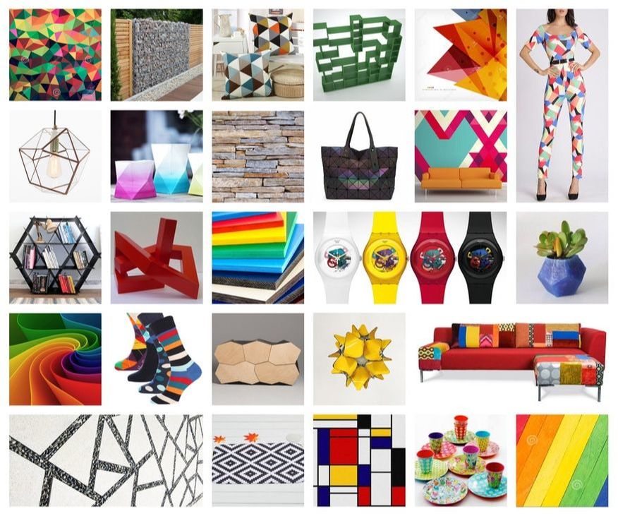 The last couple of weeks we learned what really goes into a brand. And it's a lot more than we all expected, so many little things where you don't think about when you look at the brand. An example: Heineken changed its logo a couple years back and only adjusted the letter E and rotated it a little bit, they paid lots of money for such a small adjustment. The assignment was to pick a feeling and create an image panel around it, we had to take the human senses into account while making it. Smell, Sight, Feeling, Taste and Hearing. I want you to guess what the feeling I picked was by looking at the images.  Well, what was your guess?
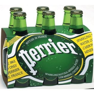
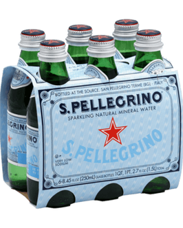
The answer is Energetic. It's the first week at school after my internship. And school means homework... So this week I got the assignment to make a brand comparison of two brands that make the same product. A good example is toilet paper, almost all toilet paper is the same. But why do people buy toilet paper from a certain brand? I have to explain why I would choose the one over the other, by only looking at the brand (I can not compare a cheap brand with an expensive brand). What does that company do that makes me want to buy their product and not the one of the other brand? I will be using the following product: Sparkling water The brands that will be compared: Perrier and San Pellegrino
Perrier and San Pellegrino both are brands that make sparkling water. It's also the main product of both brands. The two brands are both well known across the world, in most restaurants you will get one of these two brands when you order sparkling water. They're also around the same price level, what makes this an even better comparison. If I would have to choose between one of the two purely based on marketing, I would pick Perrier. Hands down. This because Perrier as a brand just puts way more effort and money into commercials and events, compared to San Pelligrino. Of course, San Pellegrino makes some commercials now and then, but I just don't get the same "feeling" as I get with Perrier. Perrier, for me, resembles class, humour and some bravery as well. Their commercials and marketing events are mostly funny and classy at the same time. They also push the boundaries of some commercials, one even got banned from TV. I really like the way they present the brand.
As for San Pellegrino, they invest a lot less in marketing compared to Perrier. Some of the commercials they made are funny, but that's about it. The idea that I do get from San Pellegrino is that it's more a drink that belongs in restaurants rather than on tennis courts or something like that. That is maybe why San Pellegrino has less marketing because restaurants that buy the product don't need ads or commercials in order to come in contact with the brand. They focus more on companies instead of consumers. As for Perrier, they focus more on the consumer. That's why my choice goes to Perrier.
I will be posting a lot more in the coming weeks, about my new project and the process of it. The projects that I've done that are not yet on this blog will also be added in the near future. Those posts will be more "product design" related than this one. So stay tuned! |