|
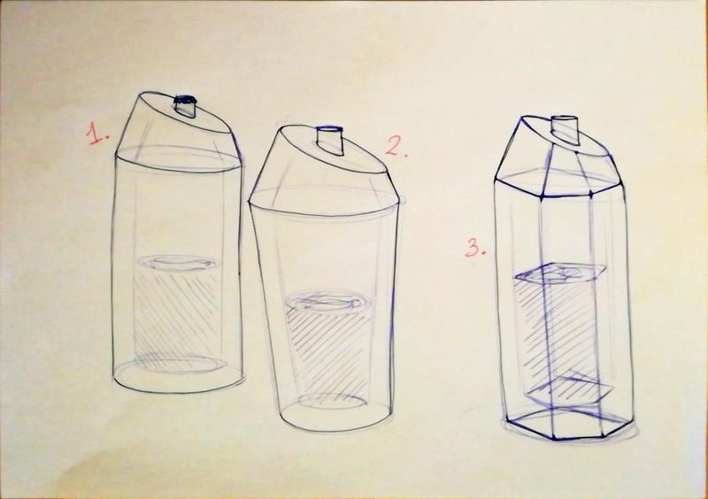
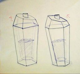
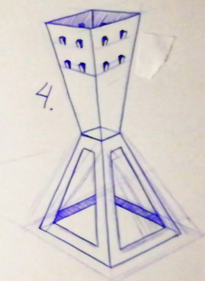
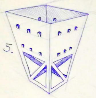
This week we got the same assignment as last week, but this time we had to use beer bottles and somebody else's elements. I got the elements Though/Cool and Sturdy from my classmate Stijn. You can check out Stijn's blog here: www.stijnipo.weebly.com. Again I made 5 versions, where number 1 is the least though and sturdy and 5 the most.
Here you can see the sketches I made beforehand.
0 Comments
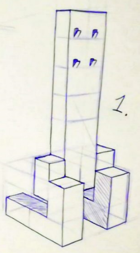
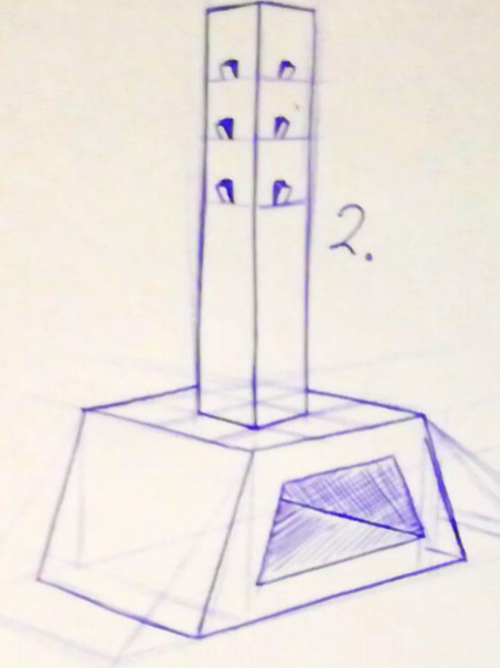
Last week I got the assignment to make different versions of the coat rack I designed before (you can see that post underneath). This time I made 4 other versions, two where I tried to amplify the two elements (simple and sturdy). And two where I toned it down a little bit. 1 is the least and 5 is the most on "elements scale". This may sound a little vague, and that's because it is vague... Hopefully, the drawings speak for themselves.

I had to make a coat rack according to my sofa-comparison I did a while back (you can see it down below). My core values where: - Simple - Inviting - Sturdy I made a coat rack that resembles those elements: 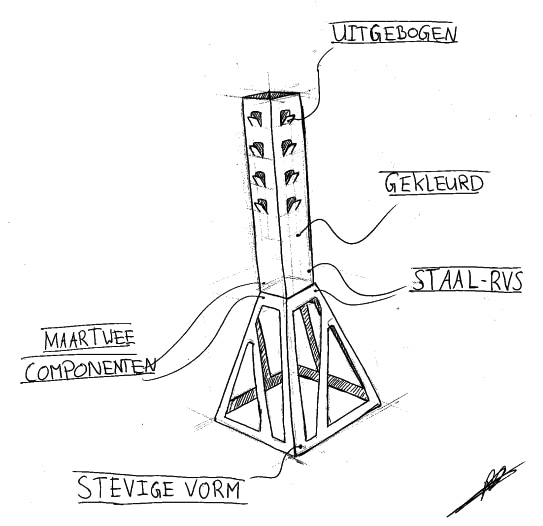 As you can see it's in Dutch.
Translation from down to bottom + what they resemble: Uitgebogen = Bent outwards = Simple Gekleurd = Colored = Inviting Staal-RVS = Stainless steel = Sturdy Maar twee componenten = Only two components = Simple Stevige vorm = Sturdy form = Sturdy I kinda left out "Inviting" in this drawing because I wanted to focus on two things specifically. So, for the coming assignments regarding this topic I will leave out "Inviting" and focus on "Simple" and "Sturdy". Reupload. Original date of upload: 6/8/2016 I got the assignment to make an illustration video for the new students next year. Why is it so easy to make 50 sketches? That's the question I'm answering in this video, in dutch however... For my mailbox project, I want my final concept to resemble some elements. These elements will be taken into account while designing and engineering the mailbox. - Inviting - Simple - Sturdy These are the 3 core elements I want to represent in the final mailbox. I got the assignment to make an illustration of a product that resembles what I want in my mailbox, and a product that's the complete opposite of that. I've made the illustration using Photoshop. The ideal: 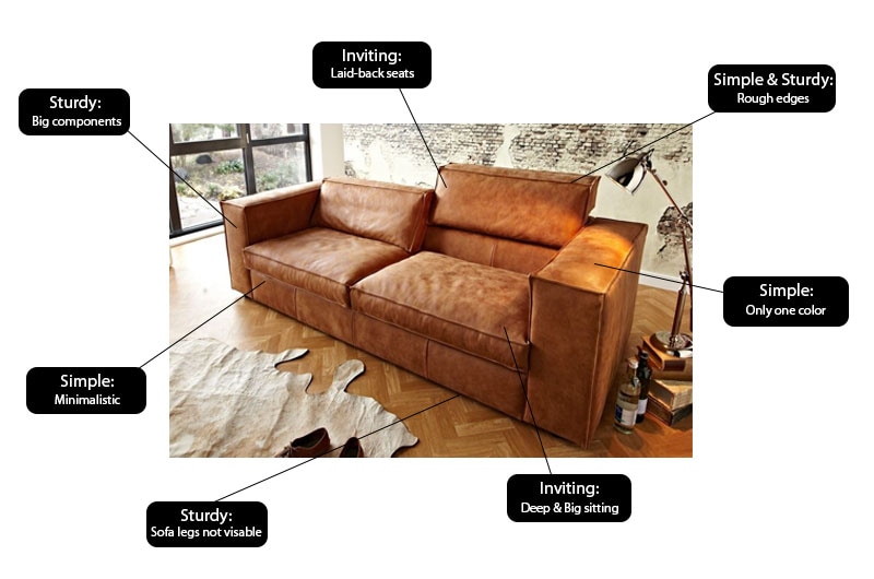 The opposite: 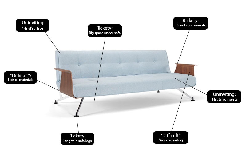 Hopefully you got a general idea of which direction I want to go with my mailbox project. More mailbox related posts will follow. Stay tuned and have a nice weekend! I will be celebrating "carnaval"! :)
|